
Website prototype
I've been working a little on my website lately. Finally have a working prototype that has helped me figure out some of the challenges I'm going to face and need to solve.

First issue is how do I make the text readable on top of an image? I'm using blur in my prototype but I still think its unreadable. I tinkered with adding a text-stroke to the heading, but I still want it to be readable for older browsers without css3 features. I'm last resorting to adding an opacity layer in front of the image. Too much opacity on a page can really hurt performance, especially with as many css3 transitions as I plan to have. I've also tinkered with adjusting the grayscale, but that didn't help readability either. Have a suggestion or an article? Hit me up on Twitter!
The second issue is the responsive layout. I would like to have the cards expand to the center of the page. The problem is when you increase the width of an element it always takes up the space to the right. I'm exploring having a negative margin-left to offset but negative margins are always a code smell so hopefully I can avoid that!
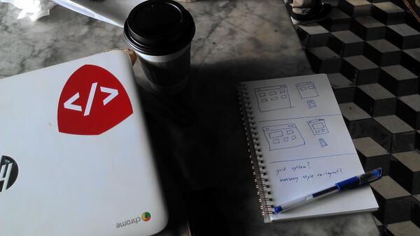
Also pen and paper for layout design is the best!
My name is Hank Yates
 My passion lies in robust client applications.
I believe in making a beautiful user experience. I believe in creating a product that helps people, in any way possible.
My passion lies in robust client applications.
I believe in making a beautiful user experience. I believe in creating a product that helps people, in any way possible.